


It's been an extremely exciting year for my friends over at Sporting Kansas City (formerly the Wizards) not only with their renaming and significant rebrand, but also the development of their new home at LIVESTRONG Sporting Park.
A friend of mine tweeted this image the other night and it was a little surreal to see something like this on a scale this large (and in such a unique execution).
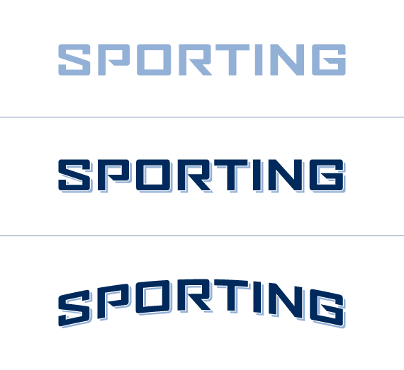
I helped develop the wordmark chosen and used in all of Sporting's new branding materials. The type is a modified version of Agency, where the subtle modifications were made to make the font more ownable for Sporting.
Original explorations above.
Big thanks to Barkley designers Nigel Morley and Dave Swearingen for their help on this project. Also, thanks to Kevin Faddis (@KevinFaddis) for posting the photo of the stadium seats.
Sporting KC's debut home match will be on June 9, 2011. I'm also very proud to say that I helped with pitch materials prior to the LIVESTRONG and Sporting KC partnership. Some very cool stuff going on.
4 comments:
Holla!
Just stumbled across this post looking for some SKC logos. I appreciate your explanation of how you came to this design. I'm a minor fan of typography and was curious what the font was. It does look fantastic in the seats.
Again thanks for a little peek behind the scenes.
I really appreciate the comments (and the tweet mention) Christian. This little post isn't even scraping the surface of the process (I could probably write a book).
I have intentions of diving into things a little deeper. It's always fun to share the process because design isn't only about the destination.
Fantastic! I'm a Sporting KC fan myself. Heading there this Saturday from OKC to see them versus Dallas.
Post a Comment