Showing posts with label environmental. Show all posts
Gradient

May 15, 2011

Sporting KC Logo
It's been an extremely exciting year for my friends over at Sporting Kansas City (formerly the Wizards) not only with their renaming and significant rebrand, but also the development of their new home at LIVESTRONG Sporting Park.

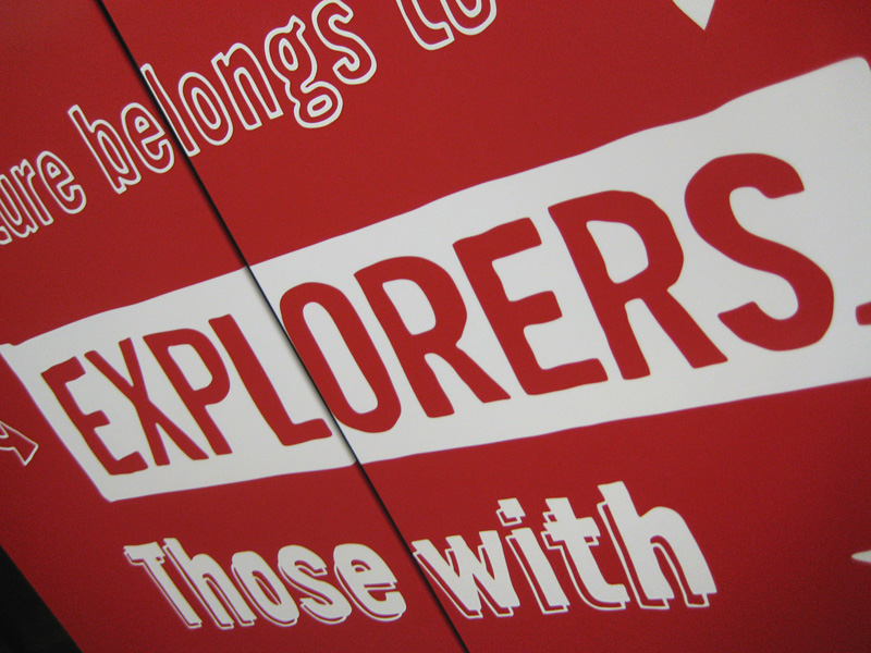
A friend of mine tweeted this image the other night and it was a little surreal to see something like this on a scale this large (and in such a unique execution).

I helped develop the wordmark chosen and used in all of Sporting's new branding materials. The type is a modified version of Agency, where the subtle modifications were made to make the font more ownable for Sporting.
Sporting KC Explorations
Original explorations above.

Big thanks to Barkley designers Nigel Morley and Dave Swearingen for their help on this project. Also, thanks to Kevin Faddis (@KevinFaddis) for posting the photo of the stadium seats.

Sporting KC's debut home match will be on June 9, 2011. I'm also very proud to say that I helped with pitch materials prior to the LIVESTRONG and Sporting KC partnership. Some very cool stuff going on.
Gradient

September 7, 2009

Barkley Elevator Clings

About a month ago, I left Willoughby Design to join the creative people at Barkley. The last month has been extremely busy (hence the lack of posting) but now that I'm settled, I can share some new work.

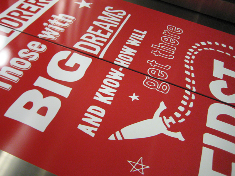
Probably one of the quickest turn-around projects I have ever worked on was to redesign the door clings that Barkley has installed in their elevators. The project came to me at lunch on a Thursday and was out of my hands and into production at 10am the following Friday.

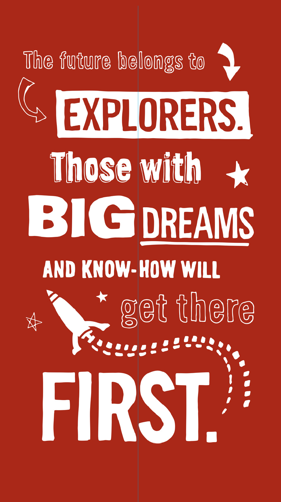
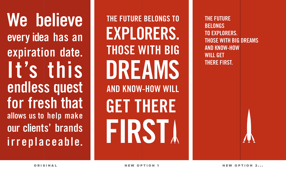
The original design was simple and clean so they wanted me to try a couple different directions. The tricky thing was to design the type so that no letters were split by the door. As you can see with the original design (Below Left), it makes for some pretty inconsistent letter-spacing and kerning. I came up with a few options, some similar to how it was and another to be a little more playful and fun (click images to see more detail).


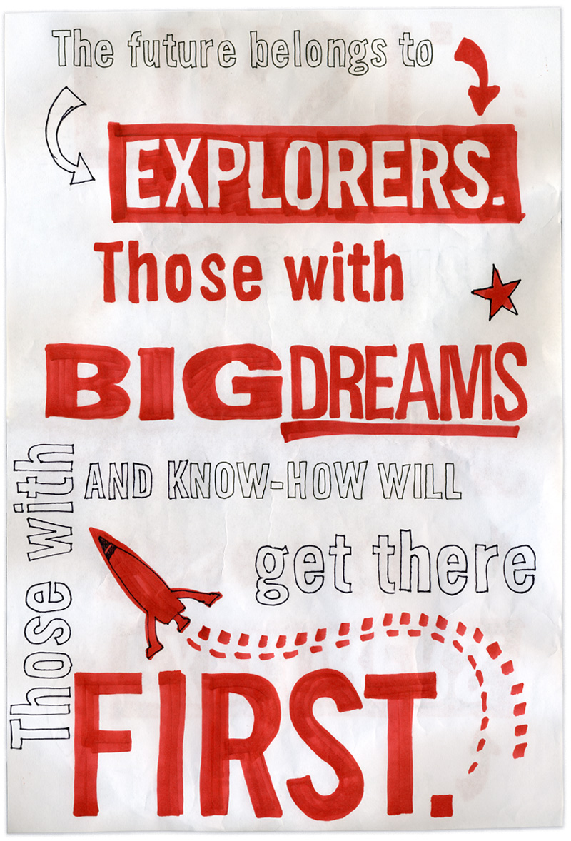
I decided that hand drawn type would have that playful and energetic feel so I roughly laid out the type, printed it out fairly large and with various sharpies and other markers, I traced over my original design. Pictured below is the design as I originally drew it and the final design that was installed.


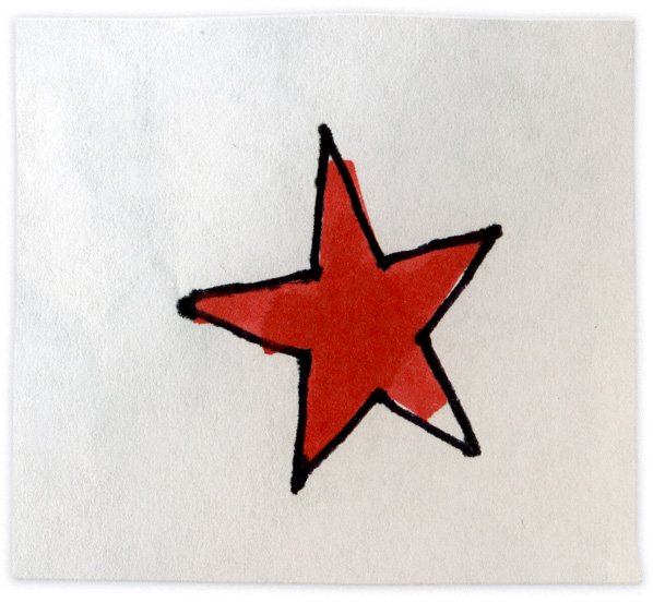
I really like this star...


As I said, we handed it off to the printer on a Friday and it was installed first thing in the morning Tuesday.