Showing posts with label graphic design. Show all posts
Gradient

July 1, 2012

Grooveshark Theme

Awhile back, I was invited to contribute a theme to Grooveshark — the world's largest on-demand music streaming and discovery service. It was kind of tricky beginning because there wasn't really a brief or design objective. I guess it was to just make something cool. With very little direction, I approached this like I normally do — puzzles and codes. You can see the full version here.


Grooveshark Theme

Details of my Grooveshark theme include moon phases, the Drake Equation, punched card as well as many other ciphering methods.

Grooveshark Theme Grooveshark Theme
Gradient

May 13, 2012

The Everywhere Project

If you haven't had a chance to check out The Everywhere Project, you should head over there immediately — well at least after you read this post. The group of incredibly talented designers and illustrators involved in this collaboration have been tasked to design luggage labels paying tribute to the classic song I've Been Everywhere.

The project was started by Adrian Walsh and I am honored to have been invited to participate. I was even lucky enough to represent my native state of Colorado. Below are some details of my submission. I embedded some puzzles and codes in there so try to figure them out — there's a handful of them.

It's hard to pick, but some of my favorites include Waterloo by Nate Luetkehans, Amarillo by Jeff Rogers and Wichita by KU alumni Matt Chase. All the others are amazing as well so be sure to check them out and return often because new ones are still being posted.

The Everywhere Project The Everywhere Project Detail 1 The Everywhere Project Detail 2
Gradient

March 24, 2012

Type Fight: Letter S

Awhile back, I was invited by Ryan Paule and Drew Roper to participate in Type Fight. Their idea is to bring two designers together and have them each create a predetermined letter. People then vote for their favorite letter between the two.

I faught against the very talented Evan Huwa. We were given the letter "S" and since both Evan and I are from Colorado, the original theme was Snow, but we weren't required to be strict to this direction. It was a close battle, but I was lucky and edged Evan out 427 votes to 328.

Type Fight has new fights weekly so be sure to make frequent visits and vote on your favorite letters.


Type Fight Letter S
Gradient

August 18, 2011

Fast Company Illustration

Fast Company Magazine Cover
I've been itching to post this for awhile, but only felt it appropriate to wait until the issue hit news stands. In June, I was contacted by an Art Director from Fast Company whom had spotted my work on dribbble. I was thrilled to be invited to do an illustration for one of their monthly sections called Now.

The article, featured in the September 2011 issue, is a brief history on the AIDS Vaccination. The icons were illustrated to represent significant milestones in the 30-year history of the illness. Great progress has been made, but a true vaccine has yet to be discovered. You can view the entire article on the Fast Company website.


Fast Company Illustrations
Gradient

May 15, 2011

Sporting KC Logo
It's been an extremely exciting year for my friends over at Sporting Kansas City (formerly the Wizards) not only with their renaming and significant rebrand, but also the development of their new home at LIVESTRONG Sporting Park.

A friend of mine tweeted this image the other night and it was a little surreal to see something like this on a scale this large (and in such a unique execution).

I helped develop the wordmark chosen and used in all of Sporting's new branding materials. The type is a modified version of Agency, where the subtle modifications were made to make the font more ownable for Sporting.
Sporting KC Explorations
Original explorations above.

Big thanks to Barkley designers Nigel Morley and Dave Swearingen for their help on this project. Also, thanks to Kevin Faddis (@KevinFaddis) for posting the photo of the stadium seats.

Sporting KC's debut home match will be on June 9, 2011. I'm also very proud to say that I helped with pitch materials prior to the LIVESTRONG and Sporting KC partnership. Some very cool stuff going on.
Gradient

May 5, 2011

On The Border

Two months of inactivity here, but for good reason. And what better day to have an update than Cinco de Mayo? Since January, the creative team at Barkley (present company included) has been hard at work. Reason being is that we are now the agency of record for On The Border. We pitched them in February and amazingly, their new menus that we've designed will be on restaurant tables in a few weeks.

Since everything is still being produced (and secret), I just wanted to make an initial post. In the coming weeks, I'll be posting various items that have been designed throughout this process. It's a little nerve-racking, but very exciting... please check back soon!

On The Border
Gradient

February 6, 2011

Notebooks

Before the holidays, a couple designers and myself collaborated on some gifts for the Barkley Blacktop design group. We designed, screen-printed and handmade 43 books for our coworkers.

We divvied up the task and designed the 43 icons to represent each individual in the group. Thanks to Ai Carver, Angela Snyder, Casey Kovich and our copywriter Jessi Hamilton.


Notebooks
Icons
Notebooks
Gradient

May 1, 2010

Pure Honey Logo

Here's the logo I did for the National Honey Board. They're in the process of a major campaign promoting 100% pure honey. Honey-flavored syrups (which contain numerous additives) are pushing pure honey off the shelves. So if you're going to be buying honey soon, be sure there is only one ingredient in it: honey. You'll be seeing more things Honey to come...

Honey One Icon
Gradient

April 26, 2010

SPIN! Club Dough

While at Willoughby, I designed the "Dough" (get it?) for SPIN! Neapolitan Pizza located in Kansas City. I had a couple samples before they were put into circulation, but I recently spent enough real money to earn one the normal way.

It's printed on Tyvek (the plastic-like substrate that lines shipping packages) for durability and each one is individually numbered. It recently received a Kansas City Ad Club Addy Award.

Spin_Front

Spin_Back
Gradient

April 22, 2010

Repeat-X Repeat-Y

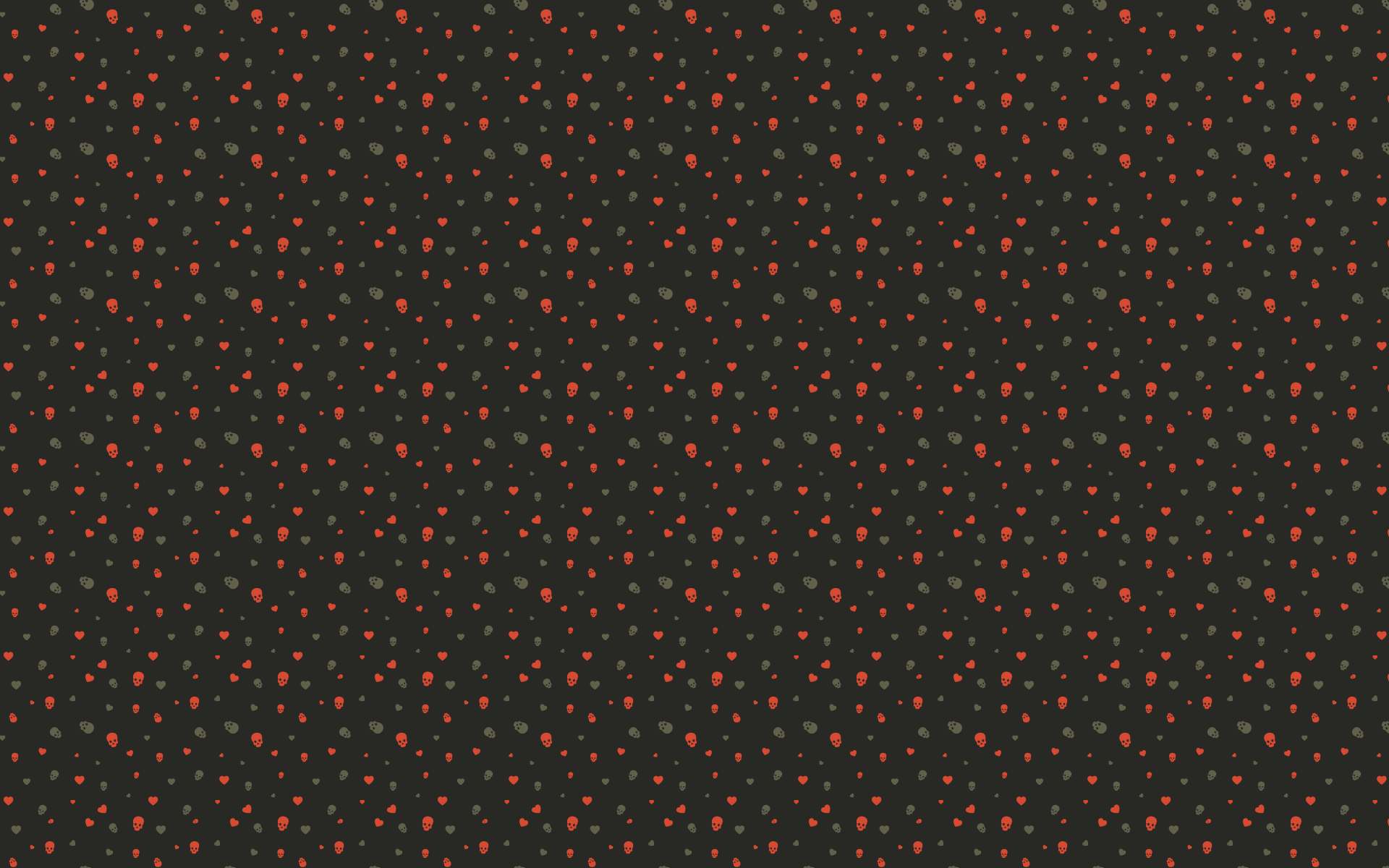
I recently stumbled across Repeat-X Repeat-Y (on Twitter @repeatxrepeaty). An awesome collaborative that 'showcases the most badass patterns from around the world'. They have a nice little collection of 200px by 200px patterns, so I thought I'd contribute my own (original pattern).

Check them out and if you decide to submit something, be sure to share a link in the comments.

Skulls And Hearts Pattern
Gradient

March 7, 2010

Kansas City Ad Club


The Kansas City Ad Club recently had its Addy Award Show and I was happy to hear that 5 projects I participated in were chosen for awards including Best of Show for the Design category. The winning entries include:

Gold, Best Of Show — New Leaf Premium Business Paper Products
Gold — The Red Rubber Ball At Work
Silver — New Leaf Paper Social Stationery Line
Silver — Willoughby Design Website
Bronze — SPIN! Club Dough

Of course, I am extremely honored to be included amongst such phenomenal work. Congratulations to all the other winners and great agencies that represent the Kansas City design and advertising community. You can see the winning entries from this year here. The website itself is awesome too; I love the theme.
Gradient

February 18, 2010

New Leaf Paper

I'm excited to see some postcards I designed are now up on the New Leaf Paper product website. I haven't been able to get my hands on my own set yet because they're currently out of stock. I guess that's a good thing right?


The illustrations for "Seasons" turned out really nice complete with customizable cards with the sayings: Thanks, Miss You, Congrats, and Hello. Here are some more details and some other products in the line I worked on...


Gradient

February 12, 2010

Random Type Detail (2)

I was digging through some archived files and found this detail of random "type" I did awhile ago. It's taken from Kiosk 37, a student produced Art and Literature Magazine from the University of Kansas. For more images of Kiosk 37, you can visit my Behance Portfolio.

Random Type Detail 2
Gradient

November 22, 2009

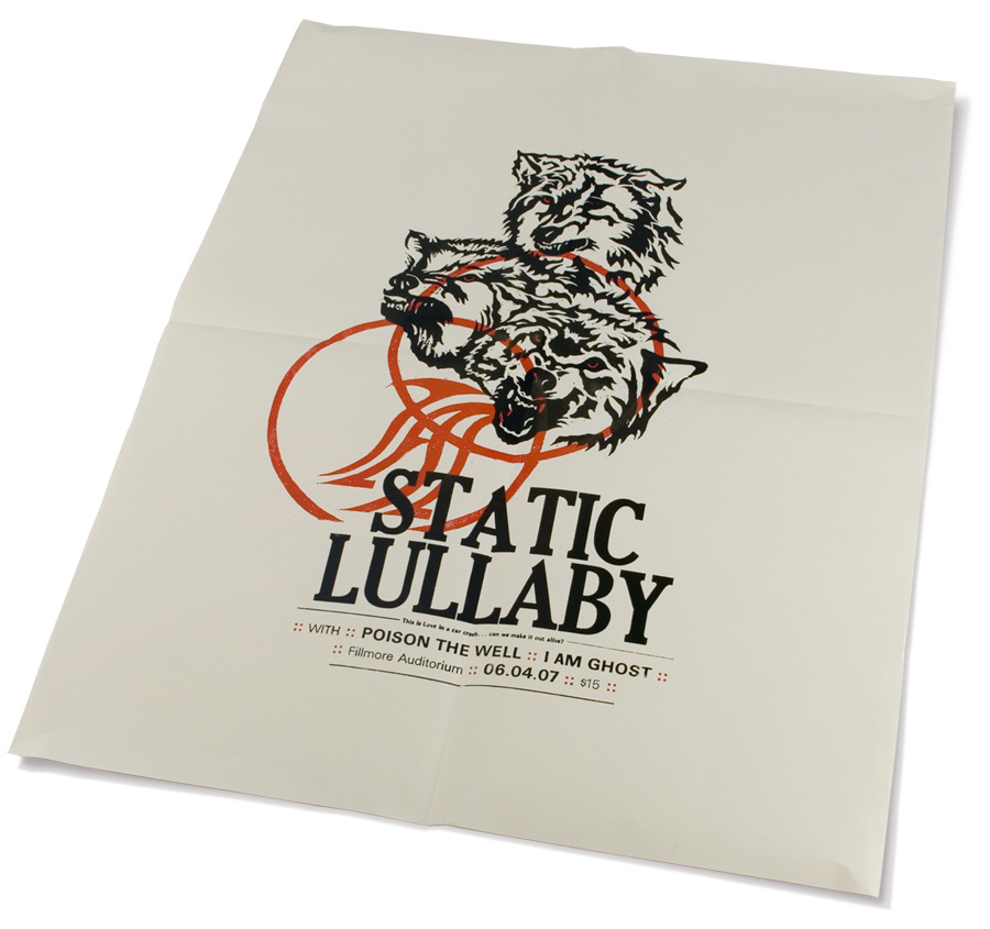
Wolves Poster - Letterpress Process


The Wolves poster was probably one of my favorite student projects. It was a piece that helped me fall in love with letterpress, a class I recommend all design students take. Although the process took way longer than originally anticipated (as are 99% of all projects), the time put in was well worth it.

1. Finding Inspiration

I pulled the lyrics, "...the wolves are coming out tonight," from the band's third cd which I thought was a perfect representation of the kind of music they play. This also painted a clear visual in my head and gave me some direction to work with.

2. Drawing And Carving

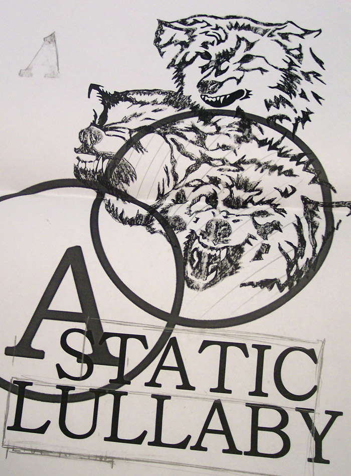
I hand drew the wolves on paper reading the right way (Click images to open a full preview).


When I was satisfied with the illustration, I scanned it and roughly laid out the type.


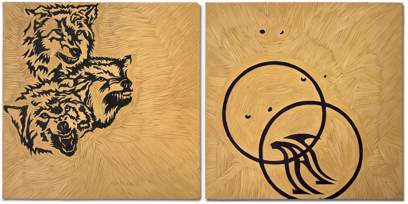
Once I had a better idea of how the type and the illustration were going to work together, I lightly taped black carbon paper to the clean linoleum block. Since I knew I was going to want two separate illustrations to register (line up) on the press, I made sure the linoleum blocks were cut the same exact size.

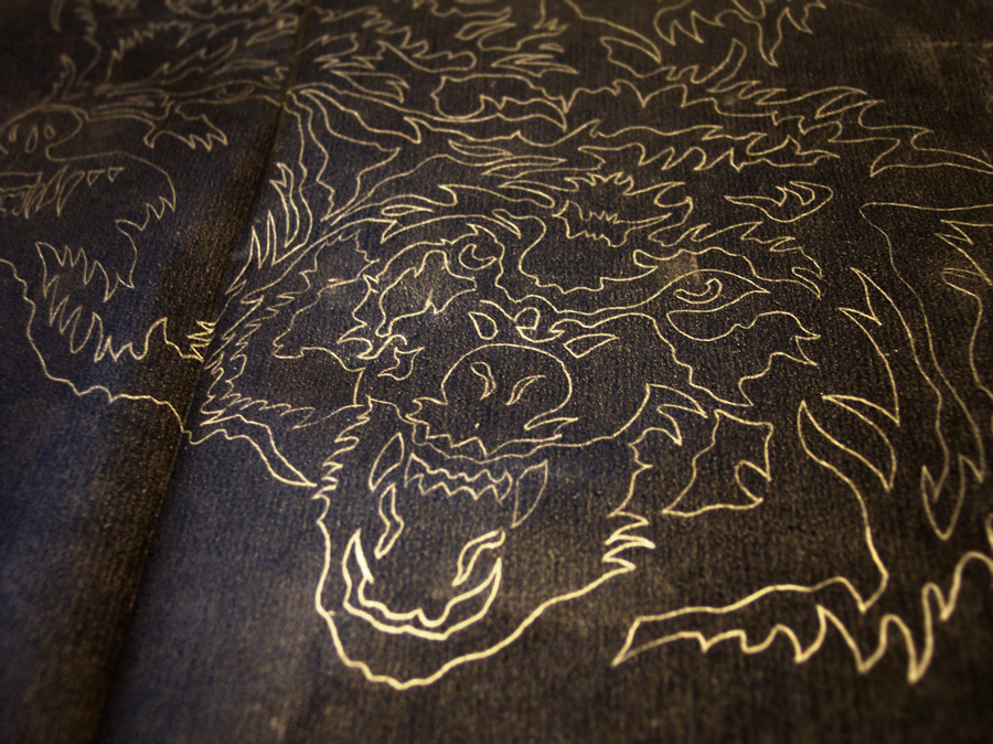
With carbon paper attached, I traced over my original illustration. When I removed the carbon paper, it left a light outline of the wolves on the linoleum and ready for me to cut (Left Image). On the second block (which was eventually going to be inked in red), I carved the eyes of the wolves, two circles, and a stylized letter 'A' (Right Image).


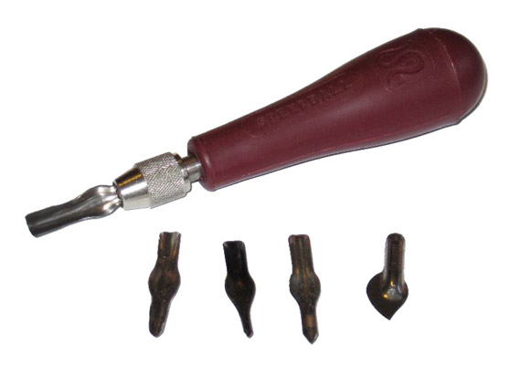
These are the tools I used to carve the blocks.


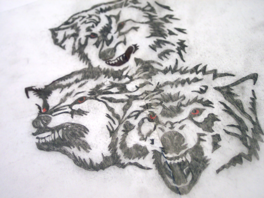
This is an image of the carbon paper after tracing the wolves onto the linoleum blocks. I used a light behind the paper to better show the lines.

3. Printing

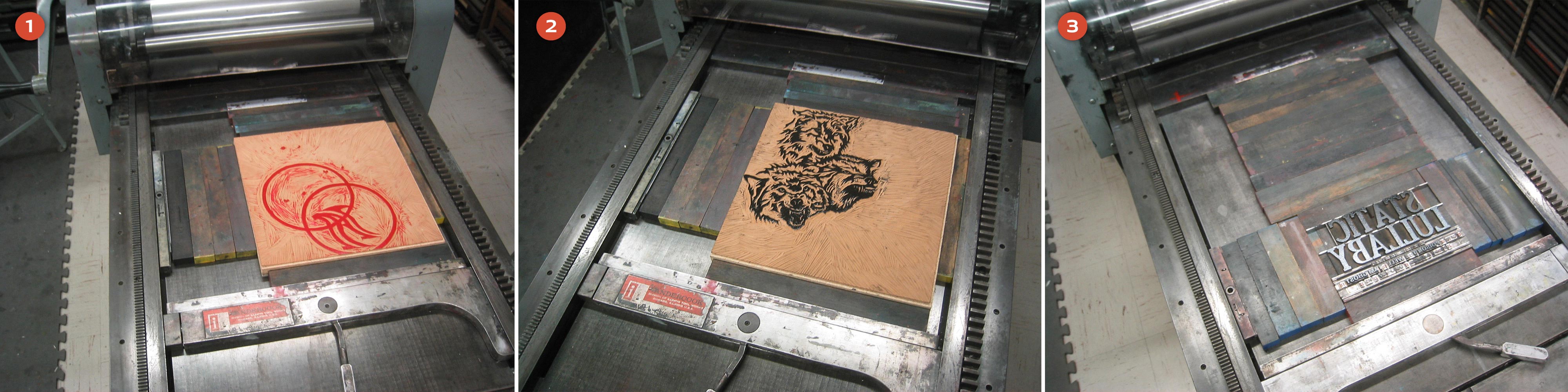
Since I wanted the red eyes to sit behind the wolves, this block obviously needed to go on the paper first (1). Once the red was printed, I easily swapped out that block for the wolves illustration (2). This transition was easy because the linoleum blocks were the same size and they were already registered in the press bed. After both linoleum blocks were printed, I moved onto the type (3).


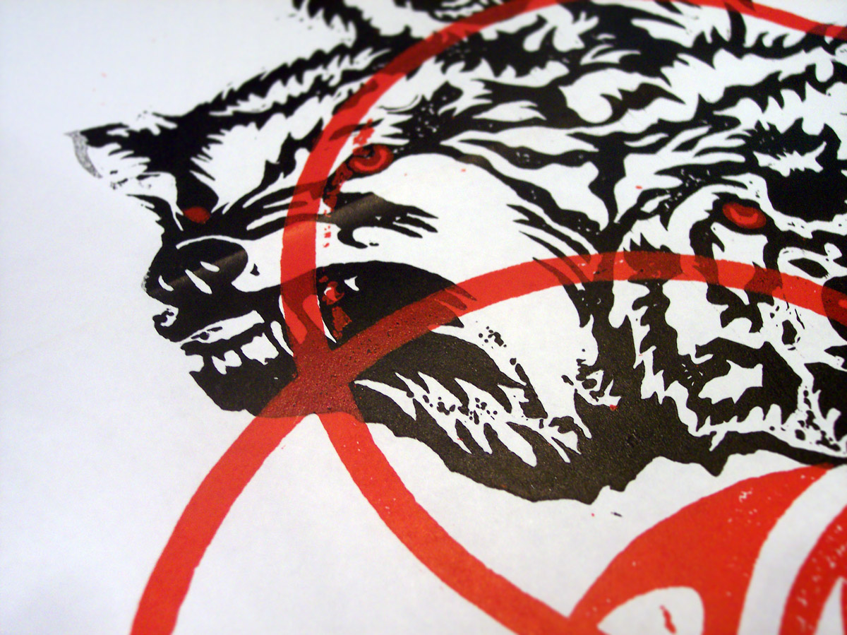
This is an image of one of the first test prints that I made with the blocks. This example shows the red layer being printed last and since the red ink is slightly transparent, it looks very strange over the black (Remember to click the images to enlarge to see all the details).

4. Setting Type

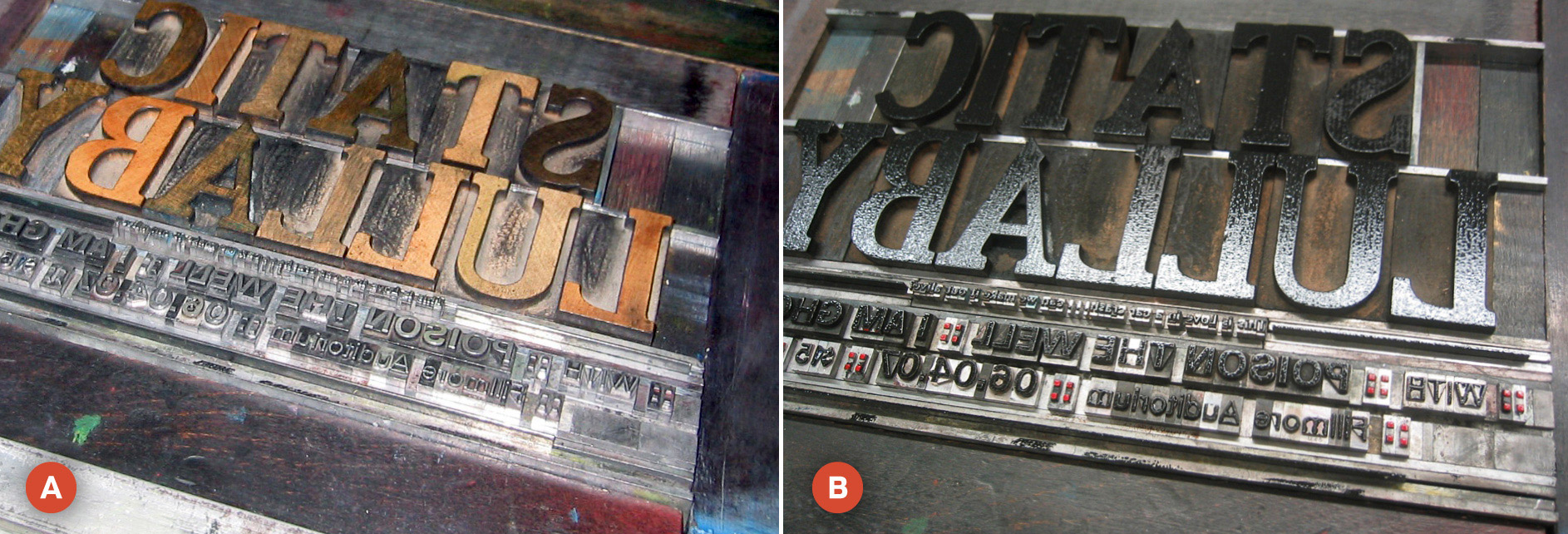
Of course, one of the more tedious (and enjoyable) things about letterpress is actually hand-setting type. Image (A) shows the type I set without ink and image (B) shows the type with ink. Notice that in image (B), the colons are red, but the rest of the type is black. This is not the right way to ink type. The proper way would have been to print the red and black type on two different runs. I was a newbie (and very impatient) so I used an eraser to hand ink the red. In the end, this probably was more of a pain than to just have set the type to be printed in two different runs... oh well.


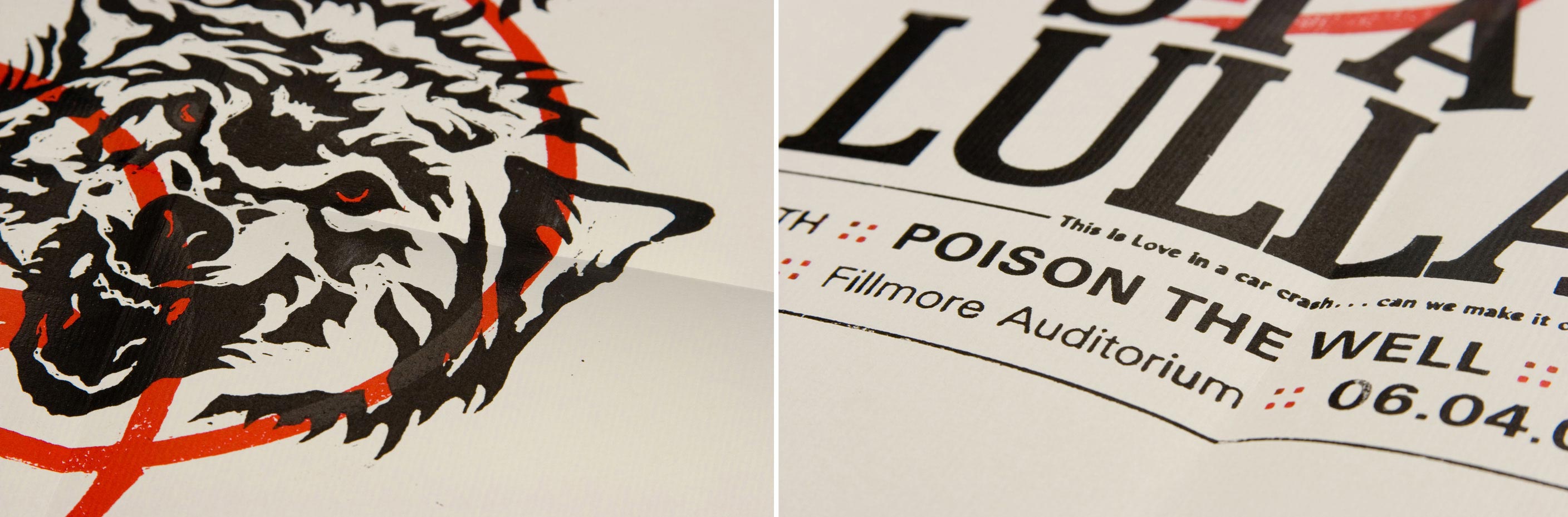
So there you have the process in a nutshell. A giant mess and about a billion hours later, I had 14 prints of The Wolves poster. The poster was chosen and published in AIGA Kansas City's A4 Design Awards Book.


Be sure to post your comments and feedback... I love hearing from you all!
Gradient

October 1, 2009

Random Type Detail (1)

I recently came across and have become addicted to an awesome blog called Friends of Type (on Twitter @friendsoftype). Throughout the day, they post little snippets of random type. Most of which is experimental, all of which is extremely awesome. Be sure to check them out!

Since I too have a plethora of type that is unseen and collecting dust, I've decided to make use of it and start posting some details of my own... consider it a tribute.

This is a detail of some hand-drawn type I did for a clothing company awhile ago.

RandomType_01

As always, let me know what you think in the comments. Leave a link to your website, thanks!
Gradient

April 25, 2009

Easy-er Mac

Albeit, Easy-Mac is already pretty damn easy to make, but I propose an idea to make it even easier. I have run into this problem before: Easy-Mac in hand, faucet available, and a microwave available. Now I'm fairly savvy in my culinary endeavors, so without a measuring cup, estimating one cup of water isn't terribly difficult.

But for a 9-year-old, who is more likely to make Easy-Mac, to estimate a cup of water might be a little difficult... you can forget about them being able to estimate 2/3 a cup required to make one packet. That's why I propose to Kraft a simple solution to this.

All they need to do is print a few extra lines on the package that holds the dry noodles (A). As far as production goes, nothing extra is being added. The bag already has "Tear Here" printed on it, so it's only a simple adjustment. To measure 2/3 cup of water required to make one packet, fill to the bottom line. To measure one cup required to make 2 packets, fill to the top line.


After you add a couple simple lines and the words "For One Packet" and "For Two Packets" all that's left to add is another diagram to the cheese mix pouch (B). And now you have yourself Easy-er-Mac... simple as that.

Gradient

April 24, 2009

Kiosk 37 & Smashing Magazine

It's already made an appearance before, but Kiosk 37 has once again been featured in a Smashing Magazine post. This time, it was featured in Creative Print Typography Layouts. Check it out, there's also a wealth of inspirational work that's definitely worth a look.

It was also featured in the June of 2008 post Beautiful Brochures and Booklets. Smashing Magazine is an online magazine/blog tailored to the creative industry. They always have some great posts and a huge subscription base, which means a lot of exposure. If you're not familiar with it, it's worth adding it to an RSS Feed.

Gradient

March 12, 2009

How to add a graphic to the side of a book

I randomly received an email from a student at The University of Missouri inquiring about a process we used while making Kiosk 37. Coming from KU, I put aside the fact that she attends Mizzou, and to help out a fellow student I wrote her a tutorial explaining the process. With that said, it has also inspired me to start a Journal (not a fan of the word "Blog"). This is a place where I will document the random things I learn. Whether it's a trick in Photoshop, a unique process I experienced, or a simple line of code that took me 12 hours to get right, I'll gladly pass the information on in hopes that you too will learn something new. Check back often, I plan to update on a biweekly basis.


STEP 1: FIGURING THE BASICS OUT

Before we begin, we need to know a few details about the final book. For Kiosk 37, we knew it would be 112 pages (56 spreads). When looking at the edge of the book, there are 56 individual pages. We don’t want the graphic to appear on the first and last two spreads of the book so we’re going to subtract 4 which means the graphic will appear on 52 page edges. That’s it for the math.

STEP 2: PREPARING TYPE IN ILLUSTRATOR

Create your type, outline it, ungroup it, then “Add to shape area” and Expand your graphic (A). Once that is done, draw 51 lines (51 lines will eventually give us 52 rows). We want each “row” of the graphic to be divided evenly. The best way to do this is to use “Vertical Distribute Center.” To divide them perfectly even, I add 2 extra lines: one aligned to the top of the graphic, and one aligned to the bottom (B). Press “Vertical Distribute Center” then delete those two extra lines.


Select all the lines as well as the graphic, then in your Pathfinder Palette, select “Divide.” This creates all the little pieces of the letters (C). By default, they will be grouped so ungroup them. You will also have invisible lines (C1) in the white space between the letters so select all of those random lines and delete them. You now have a bunch of individual little shapes thus leading us to the extremely tedious part. To avoid issues when pasting in InDesign, this next part is important. Select the shapes that are contained in their respective row one row at a time and click “Add to shape area” and Expand (D). Do this for each of the 52 rows. I alternate colors to help better illustrate which row of shapes should be added together. Once every row is done, open your Appearance Palette and double check to make sure none of your rows are grouped in any way. Select each row one at a time and make sure it reads as a “Compound Path.”


STEP 3: MOVING THINGS INTO INDESIGN

Once you have your rows made in Illustrator, select everything and simply copy and paste into InDesign. Once in InDesign, your graphic should be grouped by default so ungroup it (E). You should now have 52 rows. Rotate everything 90˚ counter-clockwise and place on the edge of the document at the height you want it. It should be on the right page of the spread (F). Now, just copy and Paste-in-Place all rows throughout the document moving your graphic over one row per page while deleting the row that was on the previous spread (G).


STEP 4: OTHER THINGS TO CONSIDER

Obviously, the success of this effect depends greatly on the quality of the printer and their ability to trim accurately, so you may want to make them aware of your intentions. In an ideal situation, you would only need one row per page but chances are, that won't be the case. Take in account the bleed and if your rows are very thin, you may want to include 2 or 3 extra rows in the Live Area of the page.

This was more of an experiment for Kiosk 37 that went fairly well, but I have to note that while some books turned out very nice, a small number didn't turn out so well. Just keep that in mind. If you're interested in receiving a free copy of Kiosk 37, send me an email (luke@lisidesign.com) and I'd be happy to arrange something with you. Well that's it for my first post. You can download a PDF of this process here. If you made it this far, thanks! I promise, my future posts won't be this long.

Putting our differences aside, I'd like to thank Sarah from Mizzou for inquiring about this process. You can check out her blog "Come Out And Play" here. Thanks Sarah!