A couple weeks ago, I was invited to do a mix and album cover design for the ever-popular Designers.mx. The instructions are simple — pick 10 songs and design a cover.
I was pretty excited and it seemed obvious that my choice of music would be aimed to fill a niche that was lacking in their current library. I also wanted an emotional and centralized idea that tied my song choices together. My mix, appropriately named "End Of The World", is a compilation of post-hardcore and (experimental) metal. The lyrical themes reflect on everything from zombies to religion to failures of heroes and cities left in ruins. The sense of desperation and panic tightly thread together with the music in a powerful and intense set.
I'm curious as to what your thoughts are so give it a listen and let me know what you think not only of the music but the design as well. Feel free to leave some comments.
1. Revive // The Devil Wears Prada 2. Taking Cassandra To The End Of The World Party // Fear Before The March Flames 3. The Portrait // Oceana 4. A Lesson Never Learned // Asking Alexandria 5. The Life They Promised // The Air I Breathe 6. The Novelist // Bleed From Within 7. The Color Theft // Oh, Sleeper 8. The Sadness Will Never End // Bring Me The Horizon 9. Monument // Miss May I 10. Fill; Avoid // The Color Morale
The other day, I posted a handful of fairly complex and confusing tweets. Well, at first glance they were confusing, but when explored, they begin to make sense. Inspired by a peculiar element in the new United States Cyber Command logo (not specifically the design), I dug a little deeper to find out what exactly was going on.
The logo itself has a sequence of seemingly random letters and numbers. This message can be decrypted using MD5. The online encrypter and decrypter can be found here. I found it appropriate to experiment with this method of encoding resulting in a series of 4 tweets. They go something like this so play along...
The Tweets
"I am going to have a series of tweets (4) that will probably be the most complex sequence of tweets ever. Try to follow along..."
Tweet #1 "...try to follow me here: 0aff9347a6f51dd35b254b549b2be015 Using MD5, this sequence can be decrypted to song lyrics."
Tweet #2 "With that being said, you can tweet a message longer than 140 characters. Just encode your message to an encrypted MD5. For example..."
Tweet #1 only included the song lyrics. Tweet #2 contained no encoded information.
Tweet #3 is where things began to get complex because it included a series of encryptions embedded within each other (Red, Dark Gray and Yellow). Only with a short sequence of letters and numbers, I was able to include a significant amount of information.
Confusing yes; awesome yes. The illustration above tries to make better sense of what's happening with my tweets and how the information is being embedded.
Tweet #4 didn't really have anything to do with the information.
Summary
I guess the whole purpose of this exploration is showing that a huge amount of information can be encoded in a sequence of only 30-40 characters. This means that you can tweet a message way longer than the 140 characters Twitter allows. Now, I'll admit it's not the most efficient or practical means of getting your message across (especially with applications such as TwitLonger), but it is much more fun.
The series Into The Universe With Stephen Hawking started last week on the Discovery Channel and as expected, it was awesome. In the show, they mentioned what has become known as the Wow! signal.
This intense radio signal was detected in 1977 and lasted 72 seconds. What made it so unique is that the signal didn't have regular solar-system attributes leading scientists to believe it was artificially created. The signal has not been re-detected since.
I recently stumbled across Repeat-X Repeat-Y (on Twitter @repeatxrepeaty). An awesome collaborative that 'showcases the most badass patterns from around the world'. They have a nice little collection of 200px by 200px patterns, so I thought I'd contribute my own (original pattern).
Check them out and if you decide to submit something, be sure to share a link in the comments.
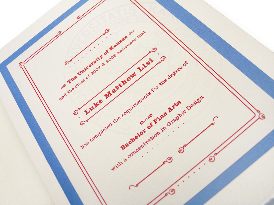
I can't believe that it's been 2 years since I graduated from the University of Kansas. Sadly, that was right around the last time I was in the letterpress room.
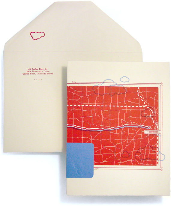
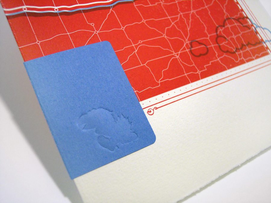
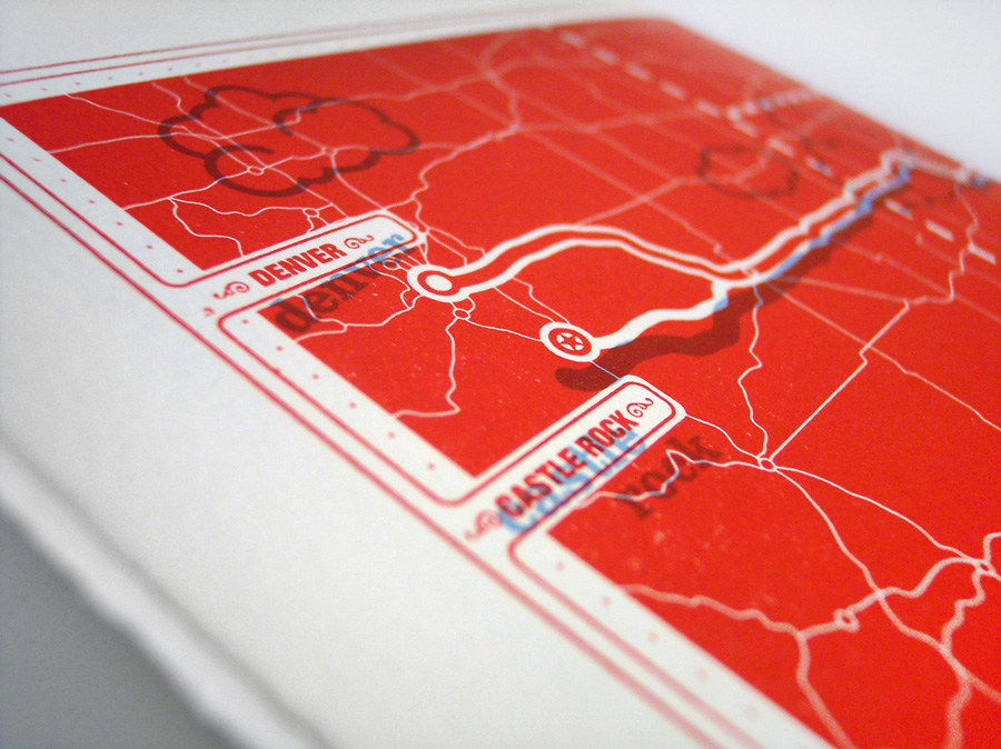
I made the drive from Lawrence to Denver/Castle Rock, Colorado (my hometown) what seems like a thousand times so I thought it was appropriate to illustrate that. Not the most exciting drive to say the least. Here's some shots of the graduation announcements I did.
I've been obsessing over type lately, at least more so than normal. In part because of the new Friends Of Type site I recently posted about, but also because of the Daily Drop Cap. I've been a fan of Jessica Hische's work for some time now, but she recently started a blog where she posts a new illustrated drop cap every day. Check it out, you won't regret it. Here's a sample of some of her beautiful (I mean awesome) lettering:
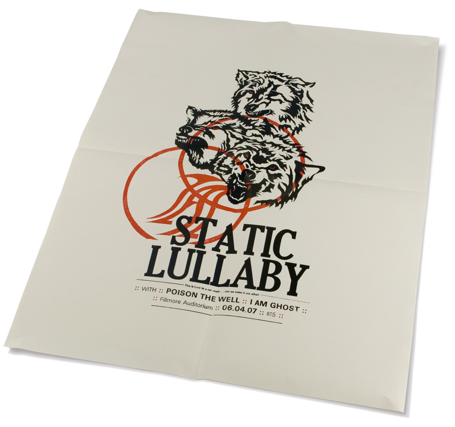
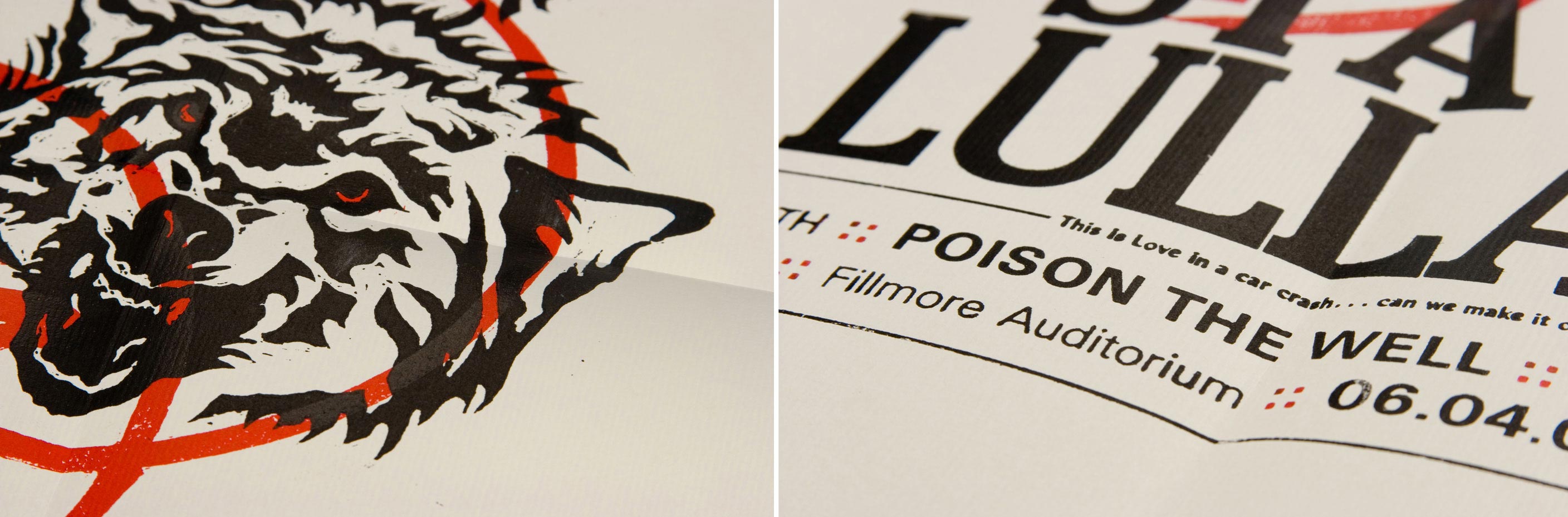
The Wolves poster was probably one of my favorite student projects. It was a piece that helped me fall in love with letterpress, a class I recommend all design students take. Although the process took way longer than originally anticipated (as are 99% of all projects), the time put in was well worth it.
1. Finding Inspiration
I pulled the lyrics, "...the wolves are coming out tonight," from the band's third cd which I thought was a perfect representation of the kind of music they play. This also painted a clear visual in my head and gave me some direction to work with.
2. Drawing And Carving
I hand drew the wolves on paper reading the right way (Click images to open a full preview).
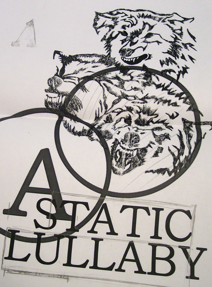
When I was satisfied with the illustration, I scanned it and roughly laid out the type.
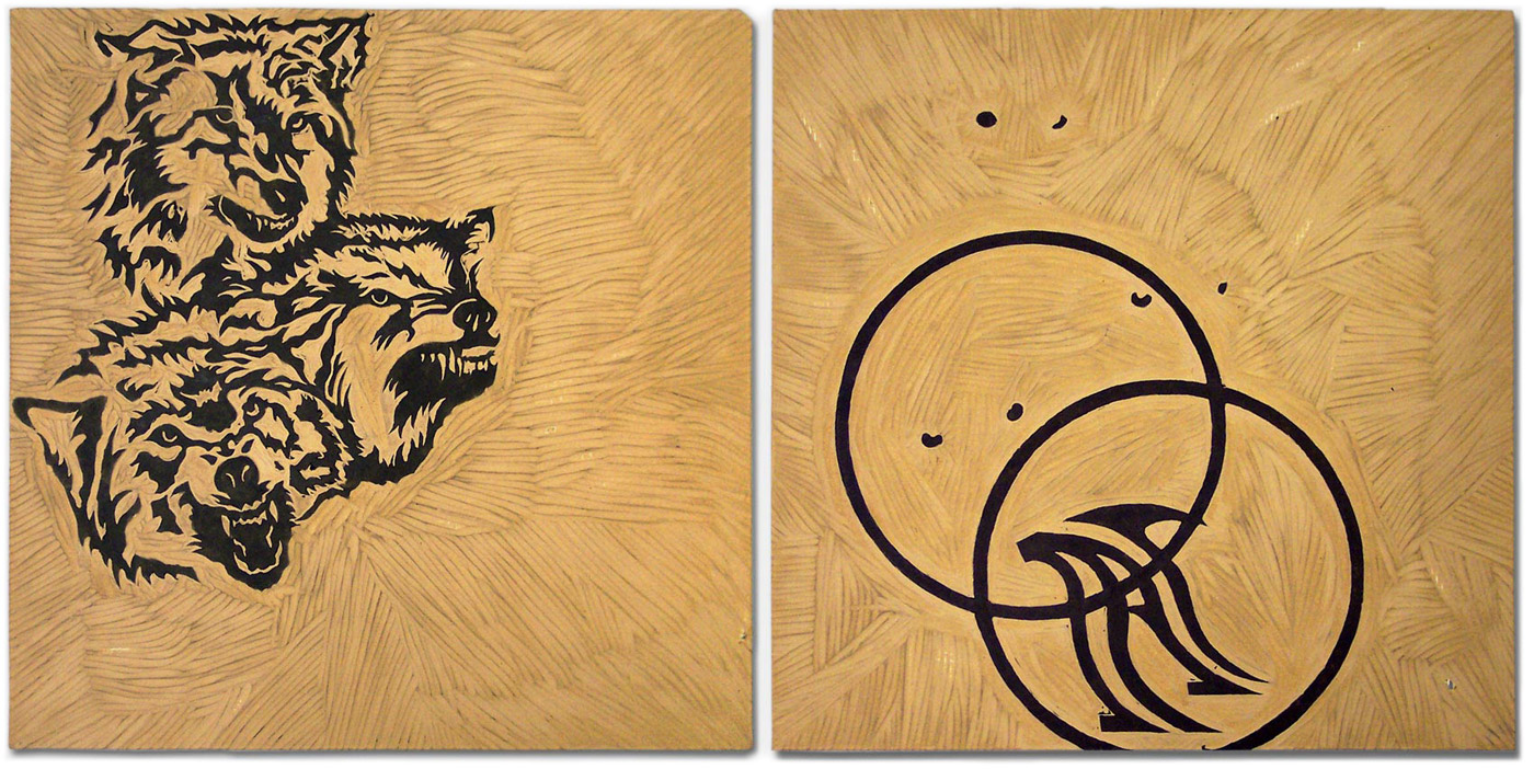
Once I had a better idea of how the type and the illustration were going to work together, I lightly taped black carbon paper to the clean linoleum block. Since I knew I was going to want two separate illustrations to register (line up) on the press, I made sure the linoleum blocks were cut the same exact size.
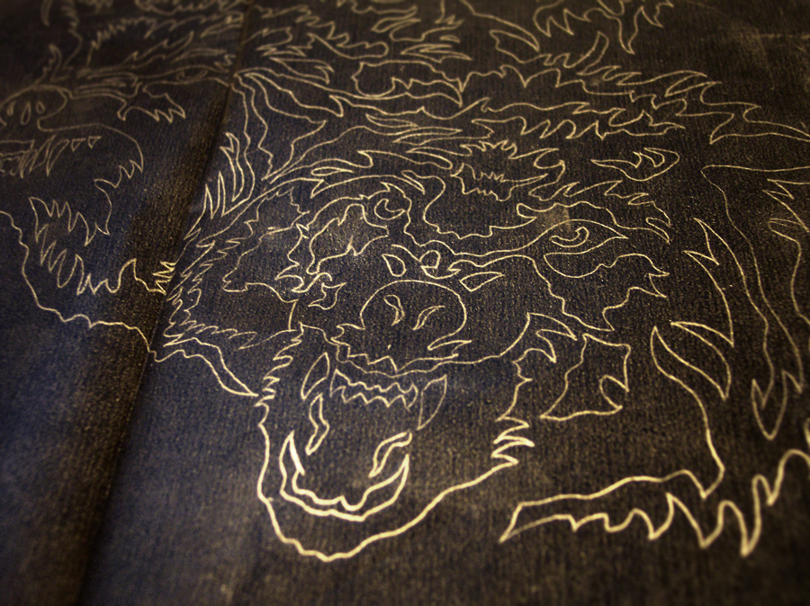
With carbon paper attached, I traced over my original illustration. When I removed the carbon paper, it left a light outline of the wolves on the linoleum and ready for me to cut (Left Image). On the second block (which was eventually going to be inked in red), I carved the eyes of the wolves, two circles, and a stylized letter 'A' (Right Image).
These are the tools I used to carve the blocks.
Image borrowed from http://www.nettally.com/palmk/RubberStampTools.html via Google Images.
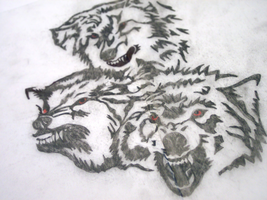
This is an image of the carbon paper after tracing the wolves onto the linoleum blocks. I used a light behind the paper to better show the lines.
3. Printing
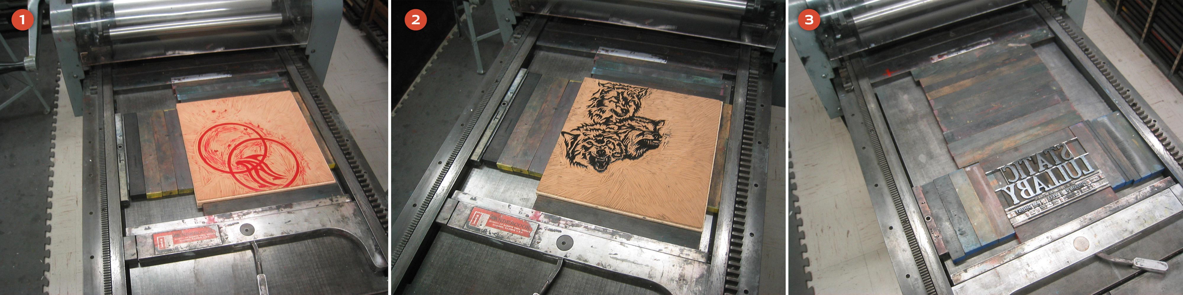
Since I wanted the red eyes to sit behind the wolves, this block obviously needed to go on the paper first (1). Once the red was printed, I easily swapped out that block for the wolves illustration (2). This transition was easy because the linoleum blocks were the same size and they were already registered in the press bed. After both linoleum blocks were printed, I moved onto the type (3).
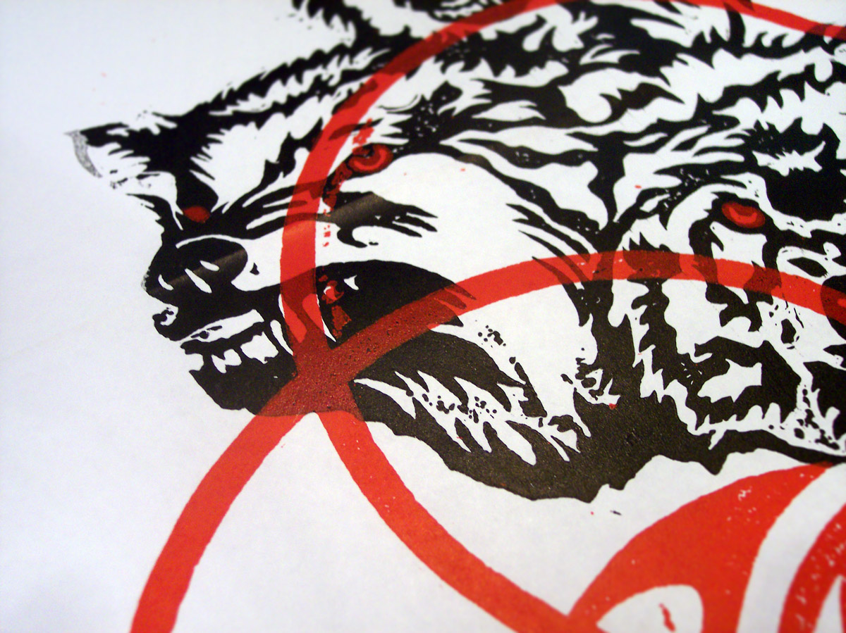
This is an image of one of the first test prints that I made with the blocks. This example shows the red layer being printed last and since the red ink is slightly transparent, it looks very strange over the black (Remember to click the images to enlarge to see all the details).
4. Setting Type
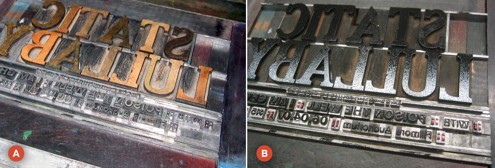
Of course, one of the more tedious (and enjoyable) things about letterpress is actually hand-setting type. Image (A) shows the type I set without ink and image (B) shows the type with ink. Notice that in image (B), the colons are red, but the rest of the type is black. This is not the right way to ink type. The proper way would have been to print the red and black type on two different runs. I was a newbie (and very impatient) so I used an eraser to hand ink the red. In the end, this probably was more of a pain than to just have set the type to be printed in two different runs... oh well.
So there you have the process in a nutshell. A giant mess and about a billion hours later, I had 14 prints of The Wolves poster. The poster was chosen and published in AIGA Kansas City's A4 Design Awards Book.
Be sure to post your comments and feedback... I love hearing from you all!
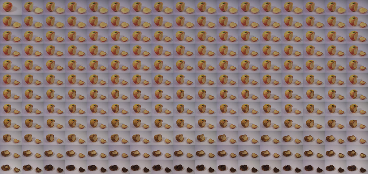
Here's a little stop motion video I made a little more than a year ago. Over 200 images were taken every waking hour for 3 months. Click "Play" to begin...
This is a mosaic of what the original images looked like.
"814 Stops Today" from the album The Changing Of The Times by UnderOath.
Let me know what you think and leave me a comment! Be sure to leave a link to your blog or website so we can check it out. Thanks for looking and reading!
I recently came across and have become addicted to an awesome blog called Friends of Type (on Twitter @friendsoftype). Throughout the day, they post little snippets of random type. Most of which is experimental, all of which is extremely awesome. Be sure to check them out!
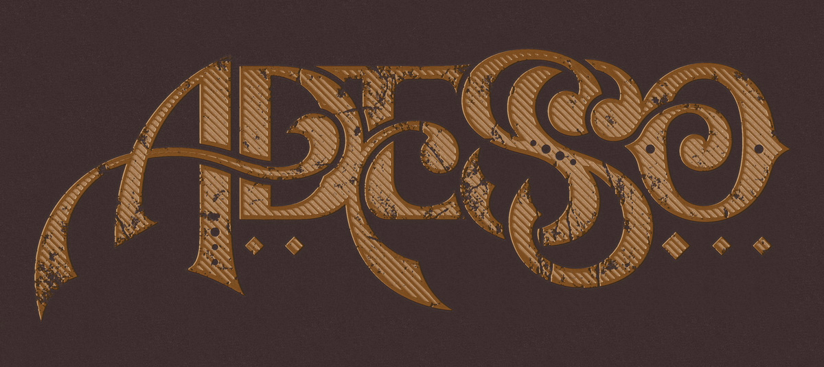
Since I too have a plethora of type that is unseen and collecting dust, I've decided to make use of it and start posting some details of my own... consider it a tribute.
This is a detail of some hand-drawn type I did for a clothing company awhile ago.
As always, let me know what you think in the comments. Leave a link to your website, thanks!
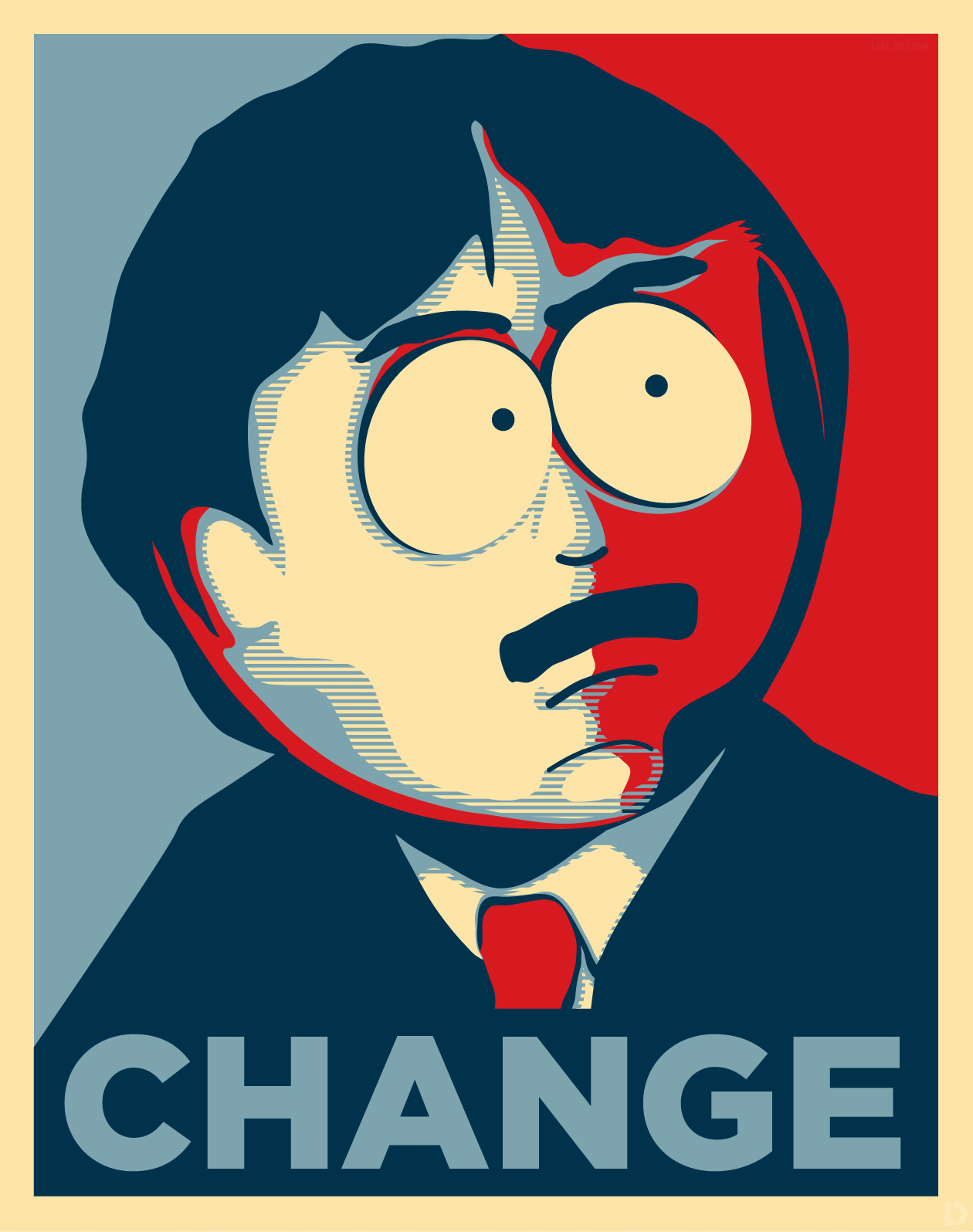
It's been awhile since I last posted so I thought I would do something fun. I had some spare time on my hands and was watching the "About Last Night..." episode of South Park so I made a poster.
Inspiration drawn from the original Obama "Hope Poster" by Shepard Fairey. Obviously, images of Randy Marsh are from South Park and owned by its creators.
It still amazes me to hear that people haven't heard of StumbleUpon. Even with the proliferation of Twitter, Facebook, and personal blogs (even though I was late to join that bandwagon), StumbleUpon has surprisingly stayed on the down low. Yes, it's normally one of those little symbols included in the flood of social icons you see everywhere, so I can see how it's overlooked, but it still amazes me to hear that people don't know what StumbleUpon is and all it's glory.
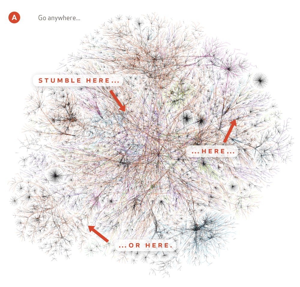
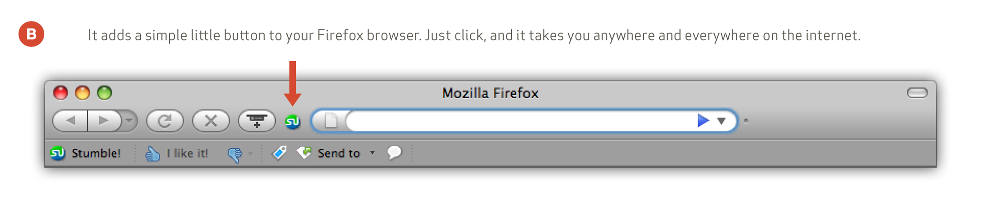
StumbleUpon allows you to do just that, stumble... on the web (A). Some of the most inspirational things I have come across online haven't been passed to me by teachers or co-workers, rather this simple little browser add-on button (B). All you do is sign up and press the button. The result, a random website.
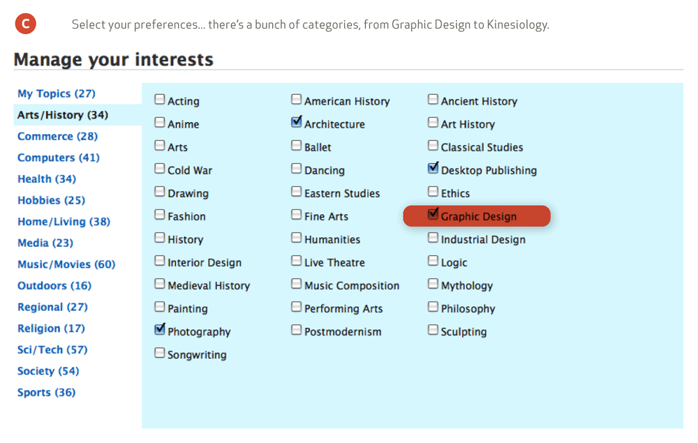
Sure, we all want to see baby animals with adorably misspelled caption bubbles, or pictures of "Epic Fails" but Stumble can be a little more powerful than that. Specify your interests (C), anything from Graphic Design to Forensics, to Skydiving, then Stumble. This results in web content more relevant to what you actually want to see.
So, if you don't already have it, I strongly encourage you to get it. Whether you're searching for a source of inspiration or are just bored out of your mind, StumbleUpon is a perfect way to spend (waste) some time.
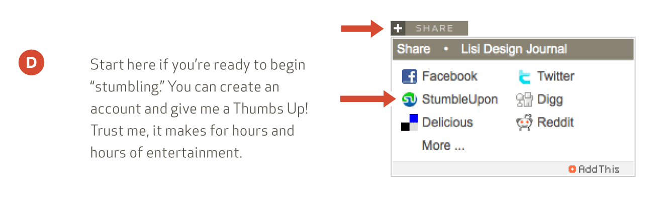
[Now for my shameless plug] You can start by "Stumbling" this page (D). It'll take you to a link to give me a "Thumbs Up." When this is done, it adds that page to the StumbleUpon database. This allows other Stumblers to find more web content thus growing StumbleUpon and making it a richer online application. Plus you can help promote your blogs and web pages... Give it a try!
This isn't so much a design related post, but if you're like me, music is something that strongly supplements creativity and inspiration. I recently made the switch from PC to Mac so these kinds of things might be old news, but I'd like to share none-the-less. Take a look at some of these iTunes add-ons... maybe you'll find something useful too. Oh, and they're all free.
1. iConcertCal
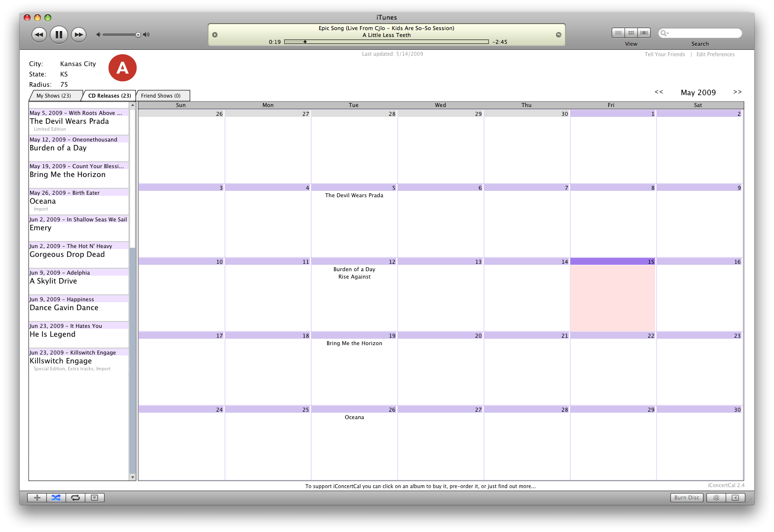
This one just blew me away. I never have really come across one amazing source for finding out both new cd releases and concerts around me until I came across iConcertCal. What makes it so impressive is that it looks at the artists in your iTunes library and automatically fills a calendar in your iTunes visualizer (View > Visualizer > iConcertCal).
The visualizer then shows you both CD releases and any concerts near you. All you do is set a city and a radius in miles (A). It's simply amazing: iConcertCal
2. AutoRate
I am one of those people who keeps an extremely clean and organized iTunes library. Call it obsessive compulsive or whatever, but every song must be spelled correct, capitalized, classified, labeled, etc. and yes rated.
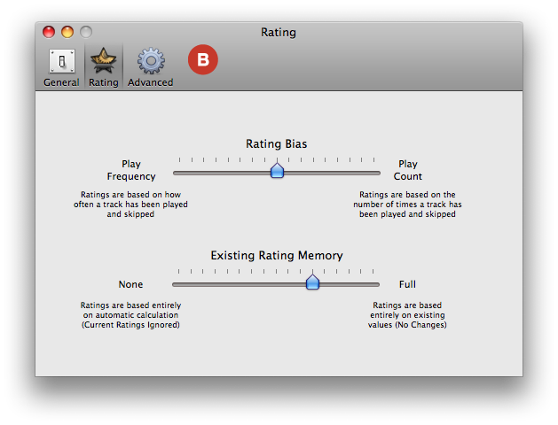
Sometimes my ratings are pretty biased but AutoRate takes your metadata and automatically rates your songs based on how you listen to them.
It takes data such as play count, skip count, and how often you listen to a song. I tried it out and it is incredibly accurate. It also gives you the ability to customize how it rates (B) and there's also more advanced settings too. It makes creating playlists much easier (and better!): AutoRate
Here's another handy hack that I recently read about. To enable half-star ratings on a Mac (C), close iTunes, open Terminal (Applications > Utilities > Terminal) and type "defaults write com.apple.iTunes allow-half-stars -bool TRUE" and hit enter. Reopen iTunes and click between the stars... sweet! If you decide later that you don't want them, use "FALSE" instead of "TRUE".
3. Last.fm
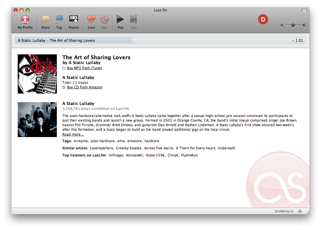
I'm brand new to this and I'm liking it more and more everyday. Last.fm automatically keeps records of your listening habits and recommends bands that aren't in your library but are similar to those that are. It also supplies some detailed information about the bands as you listen to music from your iTunes (D). It's pretty cool... I'm finding more features in it everyday: Last.fm
That's it.... hopefully you're as excited about these things as I am.