Showing posts with label typography. Show all posts
Gradient

March 28, 2012

Homestead Typeface

Last September, I released Homestead on Lost Type Co-op. I have yet to make a journal post about it, but I figure better late than never.

The Idea

Almost two years ago, I posted this shot on Dribbble with some custom lettering I had done. The Dribbble community seemed to like it and I had always wanted to design a fully functional font. As I was thinking about how this could work, it only made sense to have a layered set of fonts to really bring it to life. This also makes for tons of different combinations of styles that always do cool and unpredictable things making it more unique and fun to experiment with.

Homestead Font Sample 1

Features

Homestead is a single weight, multiple-style slab serif. There are currently 6 styles in the family. Regular, Inline and Display make up the "normal" versions of the font and One, Two and Three are a set meant to be layered and used together. This allows the designer the flexibility and freedom to make different and unique combinations of styles.

Homestead also has alternate characters built into the OpenType features. The alternate characters have a more geometric, hard-edge block shape. "Homestead" (above) and "Pioneer" (below) are examples of these alternate characters.


Homestead Font Sample 5 Homestead Font Sample 6

Out In The World

In the few months that it has been available to the public, I've seen it pop up in countless places. Student designers and design professionals alike have been frequently using it and sharing their designs with me. Not a week goes by where I don't receive a tweet or an email with a sample of Homestead living somewhere. Be it a store front, a tote bag, or a laser-engraving, there are always new and interesting ways it's being used. Brands such as AT&T, Applebee's and ESPN have used it on everything from web to print and now even broadcast. It has been awesome to see and I can't express enough gratitude.

Thanks!

I am so thankful to everyone that has downloaded it, used it and especially thankful for the gracious people that have contributed. It's much appreciated and it makes all the hard work and countless hours that went into the design worth it. I frequently get emails from wonderful people thanking me, but the thanks goes out to you. So thank you.

Also, a huge thanks goes out to the fellas behind Lost Type — Riley Cran and Tyler Galpin. Thanks to Josh Scruggs, James Edmondson and Rod and James at Psyops Type for helping me troubleshoot some technical issues. I couldn't have done it without them.


Homestead Font Sample 2 Homestead Font Sample 3 Homestead Font Sample
Gradient

March 24, 2012

Type Fight: Letter S

Awhile back, I was invited by Ryan Paule and Drew Roper to participate in Type Fight. Their idea is to bring two designers together and have them each create a predetermined letter. People then vote for their favorite letter between the two.

I faught against the very talented Evan Huwa. We were given the letter "S" and since both Evan and I are from Colorado, the original theme was Snow, but we weren't required to be strict to this direction. It was a close battle, but I was lucky and edged Evan out 427 votes to 328.

Type Fight has new fights weekly so be sure to make frequent visits and vote on your favorite letters.


Type Fight Letter S
Gradient

May 15, 2011

Sporting KC Logo
It's been an extremely exciting year for my friends over at Sporting Kansas City (formerly the Wizards) not only with their renaming and significant rebrand, but also the development of their new home at LIVESTRONG Sporting Park.

A friend of mine tweeted this image the other night and it was a little surreal to see something like this on a scale this large (and in such a unique execution).

I helped develop the wordmark chosen and used in all of Sporting's new branding materials. The type is a modified version of Agency, where the subtle modifications were made to make the font more ownable for Sporting.
Sporting KC Explorations
Original explorations above.

Big thanks to Barkley designers Nigel Morley and Dave Swearingen for their help on this project. Also, thanks to Kevin Faddis (@KevinFaddis) for posting the photo of the stadium seats.

Sporting KC's debut home match will be on June 9, 2011. I'm also very proud to say that I helped with pitch materials prior to the LIVESTRONG and Sporting KC partnership. Some very cool stuff going on.
Gradient

February 14, 2011

2.1 Hand Drawn Type

I'm a little hesitant to post this seeing as though spare time seems to be the most precious commodity lately. Here is some hand drawn type that I started awhile ago on a project that unfortunately fizzled. I hate to see it sitting around doing nothing, so I guess I'll take the opportunity to start the second edition of my hand drawn type posts.

As with my first Hand Drawn Type post, I'm not quite sure where it will go, but I guess that's part of the process and fun. Stay tuned for some updates!


HandDrawn 2.1
Gradient

September 4, 2010

1.3 Hand Drawn Type

I was finally able to finish up some lettering I started awhile back. If you didn't see any of the beginning process, here are the first and second stages.


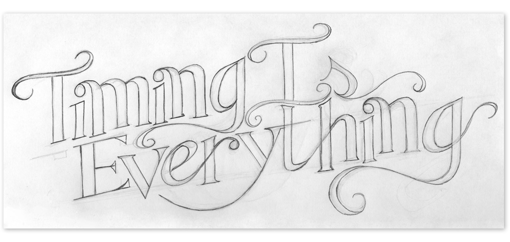
Timing
Gradient

April 14, 2010

Oh I will...

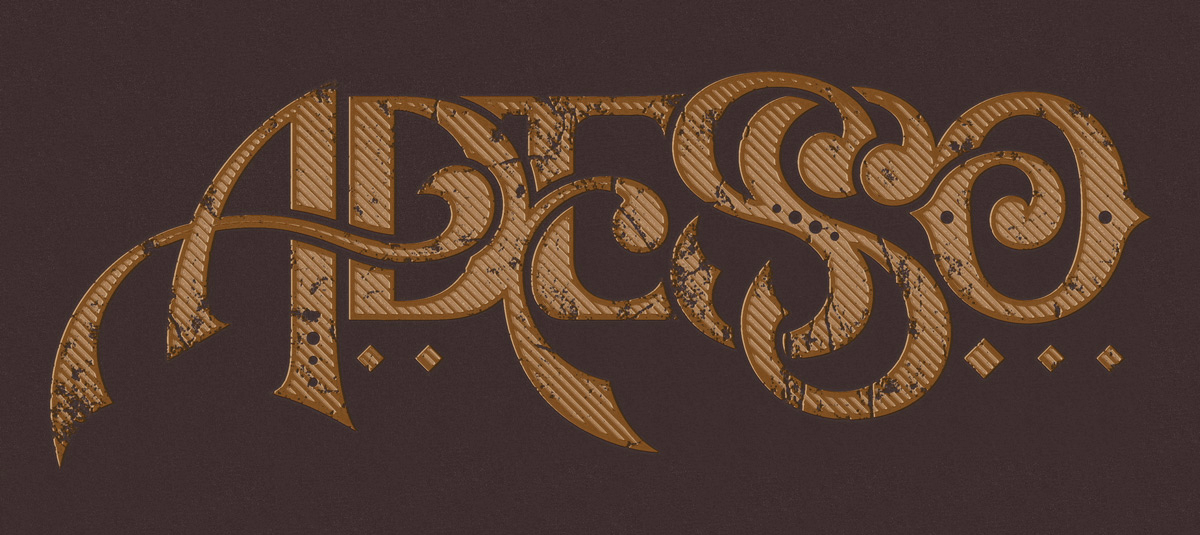
I just got back from spending the weekend in Vegas. It was great, but it's good to be back to the real world. I'll be posting Phase 3 soon so in the meantime, here's some Vegas-themed type... stay tuned!

Gradient

April 5, 2010

1.2 Hand Drawn Type

I began retouching the curves and letterforms. Here's a simple animation showing some of my progress.


HandDrawn_01-1

HandDrawn_01-2
Gradient

March 28, 2010

1.1 Hand Drawn Type

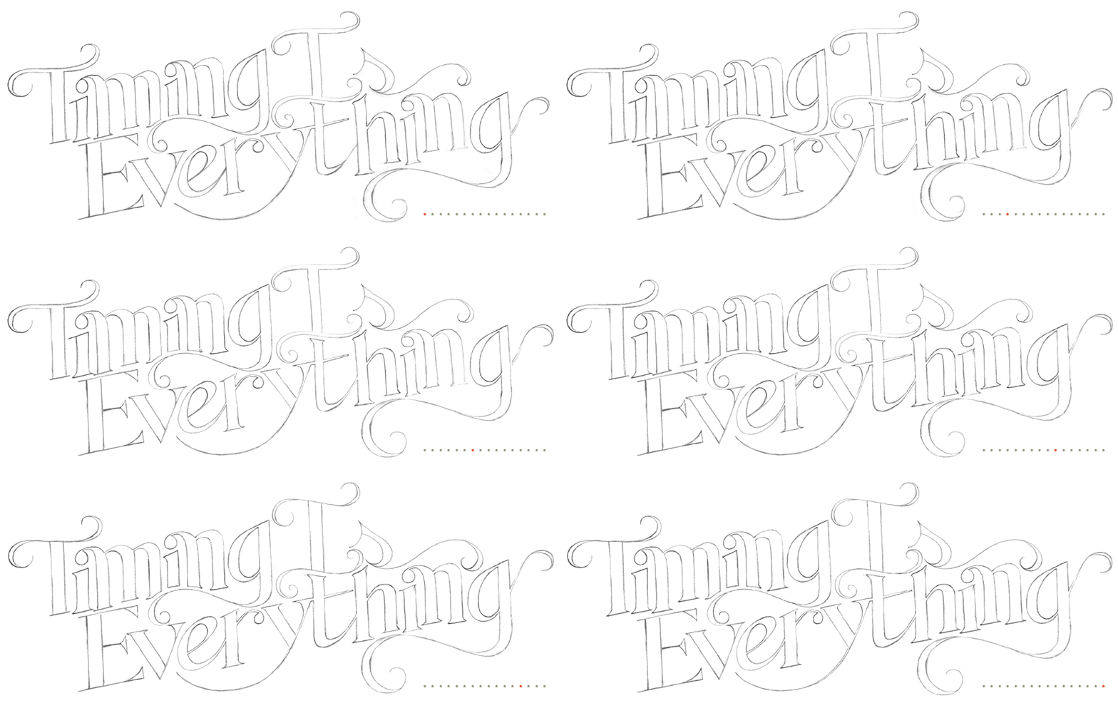
So I've decided that due to the lack of posting lately, I would be a little more motivated if I posted the beginning of my process of something. With that being said, I have decided to start a new 'series' of posts simply (and cleverly) titled "Hand Drawn Type". I have no idea where this is going to end up, but this is the first phase for "Timing Is Everything." Be sure to check back soon for the second phase.

HandDrawn_01-1
Gradient

February 12, 2010

Random Type Detail (2)

I was digging through some archived files and found this detail of random "type" I did awhile ago. It's taken from Kiosk 37, a student produced Art and Literature Magazine from the University of Kansas. For more images of Kiosk 37, you can visit my Behance Portfolio.

Random Type Detail 2
Gradient

November 24, 2009

I Heart 'Daily Drop Cap'

I've been obsessing over type lately, at least more so than normal. In part because of the new Friends Of Type site I recently posted about, but also because of the Daily Drop Cap. I've been a fan of Jessica Hische's work for some time now, but she recently started a blog where she posts a new illustrated drop cap every day. Check it out, you won't regret it. Here's a sample of some of her beautiful (I mean awesome) lettering:

Gradient

November 18, 2009

Typekit Update - FontFont Library Now Offered

After only a few weeks of being acquainted with Typekit and only a couple days after implementing it, the library is already growing. They announced today that the FontFont library will now be offered via Typekit.

This will more than likely be the precursor that opens the floodgates to other type foundries offering their fonts in this easy to use web font system. Right now, FontFont offers about 20 fonts on Typekit and as I said in my last post, this number will only grow. It's only a matter of time before we see type from Sudtipos, Process Type Foundry, and Darden Studio.

You can read the full article on Typekit's blog. If you're not aware of what Typekit is or how to use it, I'll tell you about it here.
Gradient

November 16, 2009

How To Set Up Typekit

All of a sudden, it seems that we're entering a new era in web design. One of the most noticeable changes (as of late) is the use of fonts that designers actually want to use outside the ever-limiting web standard ones. Among various methods, we have Cufón which is an alternative to another experimental flash embedding technique referred to as sIFR. I have experience with sIFR having used it in Willoughby Design's website where we used H&FJ's Whitney. I must say that although sIFR was a great solution, we had a bunch of licensing and security issues which we needed to take into account. With sIFR aside, we now have Typekit.

In a nutshell, according to their site, "Typekit is the easiest way to use real fonts on the web." To date and with the experience that I have with some of the aforementioned methods, this claim is very accurate.


I first heard about Typekit a few months ago before they opened it to the public and I wasn't really sure what it was at first. They officially opened up shop a little more than a week ago and I'm glad I've finally had some time to explore it.

1. Setting Up

Once I logged in, I simply had to enter the domain name that I wanted to use a "kit" in. I had to then copy and paste a short line of unique javascript code into the HTML head tags in my website. Note: The following code will be unique to your information.

<script src='http://use.typekit.com/FileName.js' type='text/javascript'/>
<script type='text/javascript'>try{Typekit.load();}catch(e){}</script>

2. I'm Done Already?

At first it seemed like I was, but not quite. After finishing our first step, Typekit says, "You're all set. Now go find some fonts!" Damn... that was pretty easy.

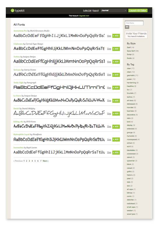
After proceeding, I was taken to a page of close to 100 fonts to choose from. It's a very respectable list and I imagine that the library will only grow. Very organized, you can search categories such as serif, sans serifs, to distressed and pixel. After searching, I selected a couple of my favorites. I have the basic free service which allows me to use 2 fonts on 1 domain which is fine for my purposes. You can upgrade (and pay) for more fonts across more domains.


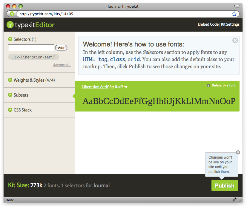
Once I selected the font of choice (called Liberation Serif and now used in my headers), I opened the "Typekit Editor".


3. Adjust Your CSS

All that was left was for me to do was add the name of the font to my CSS [example code shown below]:

h1 {
font-family: "liberation-serif-1","liberation-serif-2",serif;
}

The process is literally that easy. If I wasn't writing this article while doing it, it would have taken me no more than 10 minutes to get a working font on my site. And although the code adds a little badge in the corner, it's not intrusive and doesn't really bother me. If I were to upgrade my account, the badge would not be required and I'm sure if I was really savvy, I could hide it. In conclusion, I am very impressed with the selection and ease of Typekit... I look forward to new features it has to offer.

Wanna Add Typekit To Your Website?

If you're interested in joining the Typekit community, I have a limited number of invites that I'd be happy to share. Just post a comment with your thoughts and a way for me to contact you and I'll pass one along. Also, if you end up implementing Typekit on your site, let me know as I'm curious to see your use... Enjoy and thanks for reading. I look forward to hearing from everyone!
Gradient

October 1, 2009

Random Type Detail (1)

I recently came across and have become addicted to an awesome blog called Friends of Type (on Twitter @friendsoftype). Throughout the day, they post little snippets of random type. Most of which is experimental, all of which is extremely awesome. Be sure to check them out!

Since I too have a plethora of type that is unseen and collecting dust, I've decided to make use of it and start posting some details of my own... consider it a tribute.

This is a detail of some hand-drawn type I did for a clothing company awhile ago.

RandomType_01

As always, let me know what you think in the comments. Leave a link to your website, thanks!
Gradient

March 12, 2009

How to add a graphic to the side of a book

I randomly received an email from a student at The University of Missouri inquiring about a process we used while making Kiosk 37. Coming from KU, I put aside the fact that she attends Mizzou, and to help out a fellow student I wrote her a tutorial explaining the process. With that said, it has also inspired me to start a Journal (not a fan of the word "Blog"). This is a place where I will document the random things I learn. Whether it's a trick in Photoshop, a unique process I experienced, or a simple line of code that took me 12 hours to get right, I'll gladly pass the information on in hopes that you too will learn something new. Check back often, I plan to update on a biweekly basis.


STEP 1: FIGURING THE BASICS OUT

Before we begin, we need to know a few details about the final book. For Kiosk 37, we knew it would be 112 pages (56 spreads). When looking at the edge of the book, there are 56 individual pages. We don’t want the graphic to appear on the first and last two spreads of the book so we’re going to subtract 4 which means the graphic will appear on 52 page edges. That’s it for the math.

STEP 2: PREPARING TYPE IN ILLUSTRATOR

Create your type, outline it, ungroup it, then “Add to shape area” and Expand your graphic (A). Once that is done, draw 51 lines (51 lines will eventually give us 52 rows). We want each “row” of the graphic to be divided evenly. The best way to do this is to use “Vertical Distribute Center.” To divide them perfectly even, I add 2 extra lines: one aligned to the top of the graphic, and one aligned to the bottom (B). Press “Vertical Distribute Center” then delete those two extra lines.


Select all the lines as well as the graphic, then in your Pathfinder Palette, select “Divide.” This creates all the little pieces of the letters (C). By default, they will be grouped so ungroup them. You will also have invisible lines (C1) in the white space between the letters so select all of those random lines and delete them. You now have a bunch of individual little shapes thus leading us to the extremely tedious part. To avoid issues when pasting in InDesign, this next part is important. Select the shapes that are contained in their respective row one row at a time and click “Add to shape area” and Expand (D). Do this for each of the 52 rows. I alternate colors to help better illustrate which row of shapes should be added together. Once every row is done, open your Appearance Palette and double check to make sure none of your rows are grouped in any way. Select each row one at a time and make sure it reads as a “Compound Path.”


STEP 3: MOVING THINGS INTO INDESIGN

Once you have your rows made in Illustrator, select everything and simply copy and paste into InDesign. Once in InDesign, your graphic should be grouped by default so ungroup it (E). You should now have 52 rows. Rotate everything 90˚ counter-clockwise and place on the edge of the document at the height you want it. It should be on the right page of the spread (F). Now, just copy and Paste-in-Place all rows throughout the document moving your graphic over one row per page while deleting the row that was on the previous spread (G).


STEP 4: OTHER THINGS TO CONSIDER

Obviously, the success of this effect depends greatly on the quality of the printer and their ability to trim accurately, so you may want to make them aware of your intentions. In an ideal situation, you would only need one row per page but chances are, that won't be the case. Take in account the bleed and if your rows are very thin, you may want to include 2 or 3 extra rows in the Live Area of the page.

This was more of an experiment for Kiosk 37 that went fairly well, but I have to note that while some books turned out very nice, a small number didn't turn out so well. Just keep that in mind. If you're interested in receiving a free copy of Kiosk 37, send me an email (luke@lisidesign.com) and I'd be happy to arrange something with you. Well that's it for my first post. You can download a PDF of this process here. If you made it this far, thanks! I promise, my future posts won't be this long.

Putting our differences aside, I'd like to thank Sarah from Mizzou for inquiring about this process. You can check out her blog "Come Out And Play" here. Thanks Sarah!